Redesigning for mobile access to one of the biggest Italian sportswear e-commerce sites.

- Industry
- Sport, Ecommerce
- Location
- Milan, Italy
- Goals
- Optimise website design for mobile
- Role
- UI and UX Design
- Type
- B2B
Products used
-
-
Design
Adobe suite
Responsive re-design for an ecommerce platform
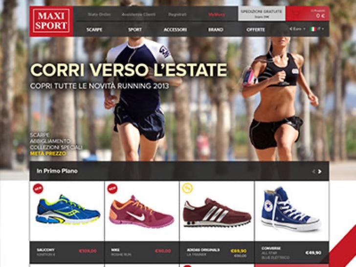
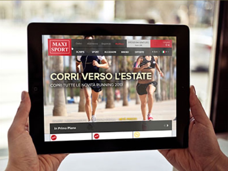
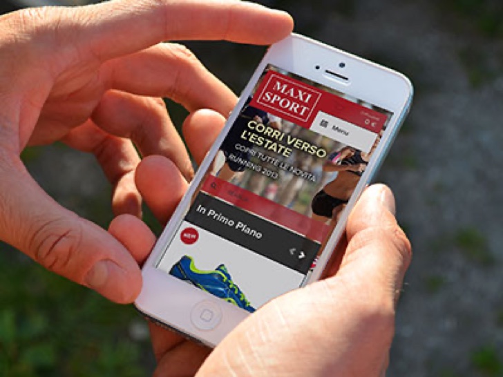
The company approached us to redesign the Maxi Sport website, envisioning how we could use mobile access to increase sales and create a smoother experience for the user.
With a 3-month timeline, we focused on delivering a responsive framework and reducing time in task-oriented flows.
One of the goals of Maxi Sport was to guarantee a shopping experience tailored to specific customers, where it's easy for them to advise on the best product for the client. They had 4 different shops in the North of Italy, more than 80 employees, and a wide range of products and streetwear.
Problem
Maxisport had an existing ecommerce website which was very out of date and didn’t really fit the needs of this growing business. Although it was technically responsive, the old design was not effective in generating significant sales from mobile devices.
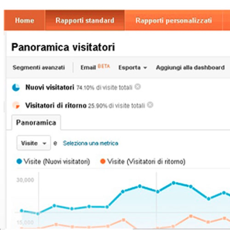
With today's online community increasingly using their mobile phones or tablets to browse the internet, they thought it was time to update the website and ensure the company is reaching the widest possible online marketplace. They also had a returning rate of costumers from desktop very low (26%).
Research
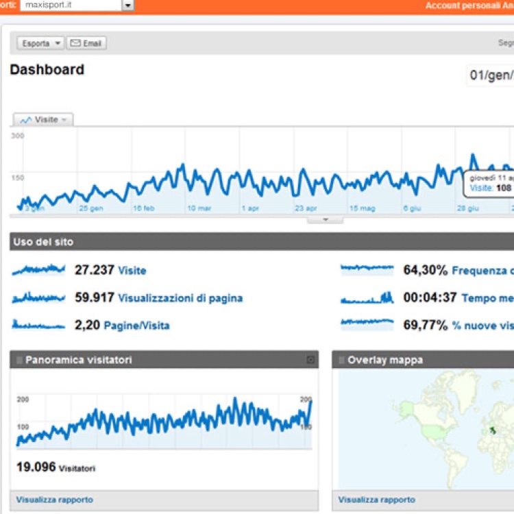
Along with defining how large strategic goals could be supported online, I took a look into Maxisport’s current store’s analytics to see the footpaths and habits of customers.
I searched for patterns in Event Tracking (to see which buttons started the conversion process), Exit Pages (looking for pages with higher abandoned rate than others) and I analysed the Search looking for the most-searched-for items and categories to make these easier to access in the redesign process. I also got datas from the customer care as lists of main problems, to understand what the users look for when trying to get support.
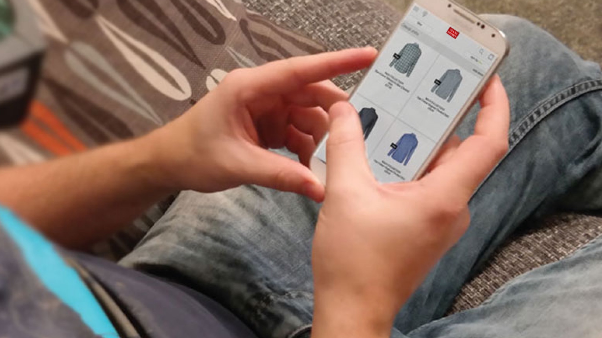
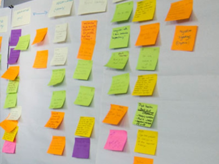
A week after the first step into the Analytics, we create an online survey to collect and understand the relevant task the user wanted to perform on the site (21), we collect the results by sending the survey thorough the maxisport newsletter. After getting the results, I used Top Task Analysis to prioritize them (8).
With these tasks in mind I had the time to conduct guerrilla usability test where the participant (13 people) were asked to complete a certain number of tasks (8) such as: buy a pair of shoes for under 55€, Find a tent you would like to buy for the summer season, create a wish list, find out how to return an hypothetical not desired t-shirt received as a present, find out Nike latest women gym outfits, purchase a item choose by user and proceed until confirm of the checkout. We kept a 95% confidence interval for the completion rate of all the tasks (using an Adjusted Wald as the sample size is smaller than 150).
The Guerrilla usability test didn't start very well because I wasn't introducing myself properly and explaining the importance of the service to people. However, after the first day, only 2 people were willing to spend time during the test; I learned and improved quickly.
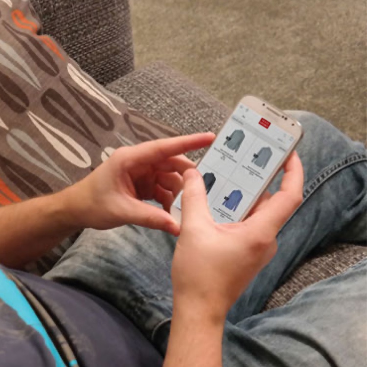
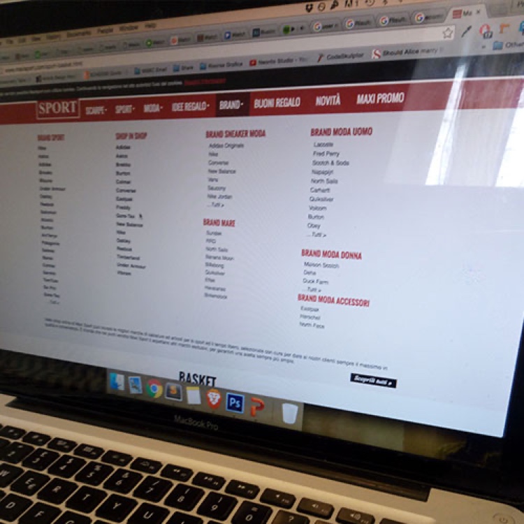
Result from Tests
Based on the observation of the users while attempting the tasks, we discover 2 main areas of intervention:
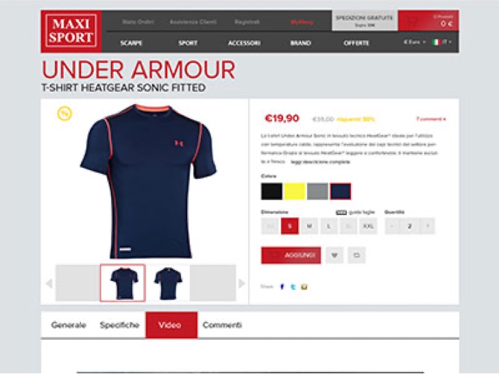
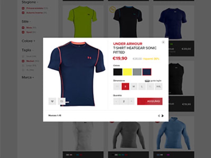
Product page: From the test, 21% of the users clicked on elements during tasks because they expected to see a larger image on the specific product page, allowing them a closer look at the details.
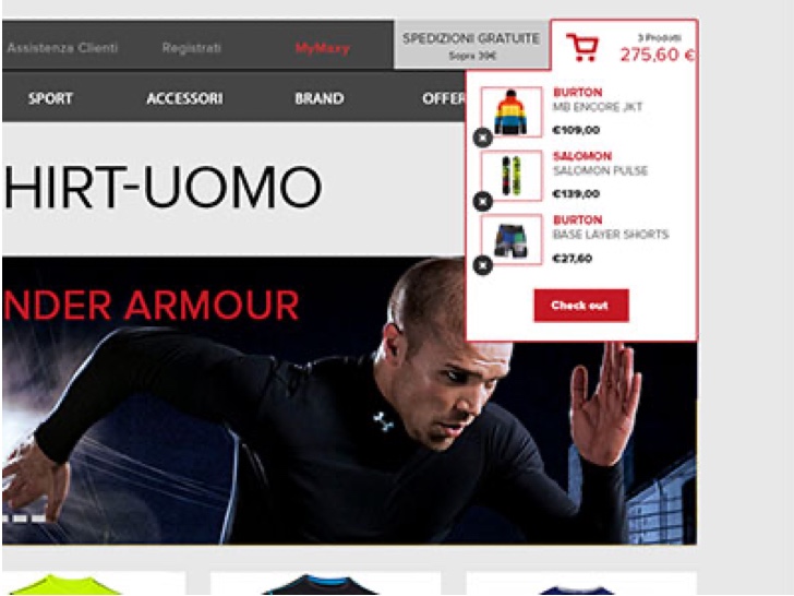
Cart page: we discovered that one of the problem during an important scenario as “adding item to the cart” was that the user couldn’t find out if an item was added. There was just an update of the quantity of items listed near the shopping cart icon.
If shoppers don’t realise they’ve done this, they get to the shopping cart and blame the site for the fact that multiple items have been added rather than the one they intended, and this had an negative impact on the credibility of the company and on the return rate of the costumers. They also couldn’t remove the elements from the cart unless the cart was open in a new page.
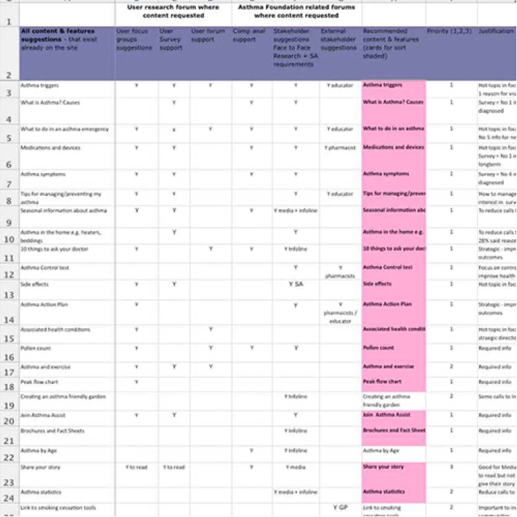
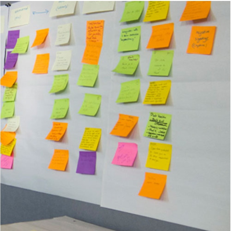
Result from Tests
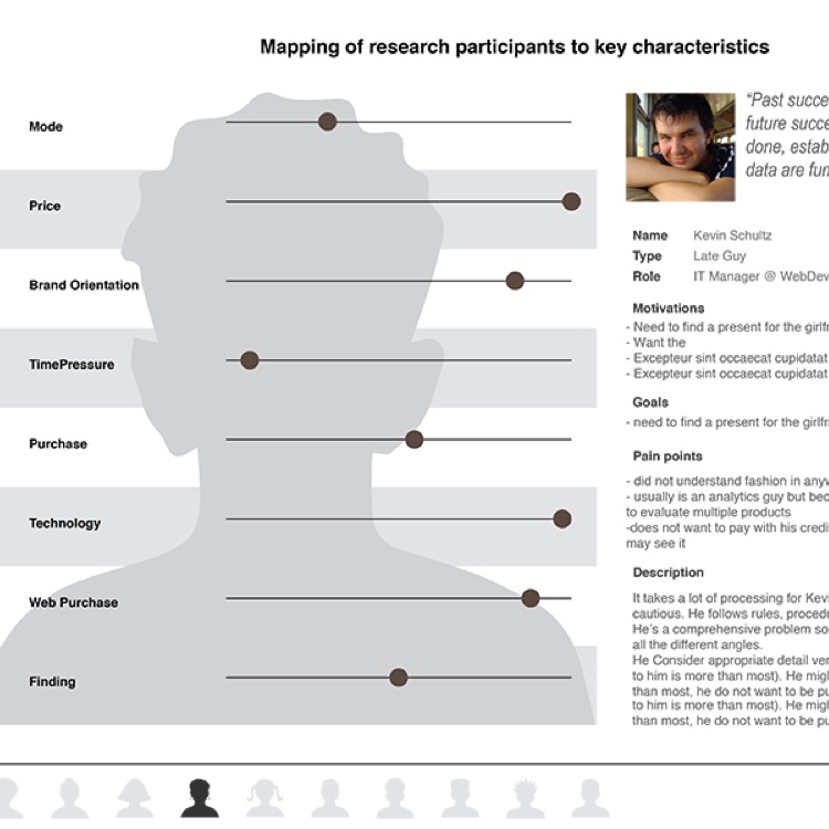
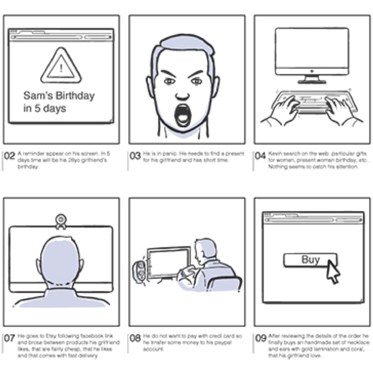
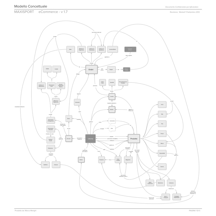
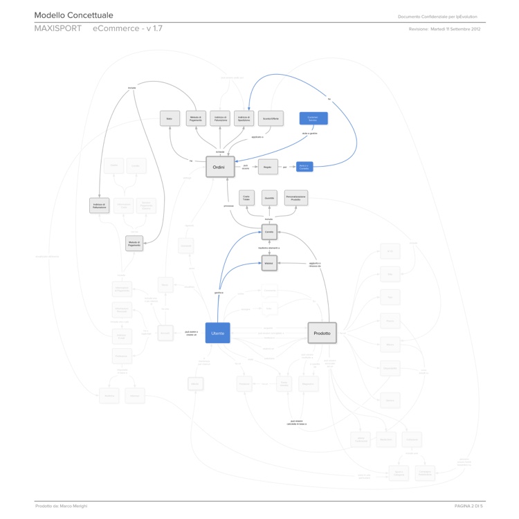
Thanks to the analysis, documentations of personas /scenarios and business cases were captured for the team to review. We produced an IA deliverables that was intended to describe the interaction, business, and technical details of all transactions the website had to support.
I initially prioritised 3 different personas (according with the client) that emerged from the collected data, and 5 main flows have been tested and developed. After the 4th iteration, full IA documentation has been provided to the team so that interactions between user and website, business cases and technical behaviours were fully described.
Wireframes
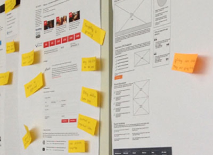
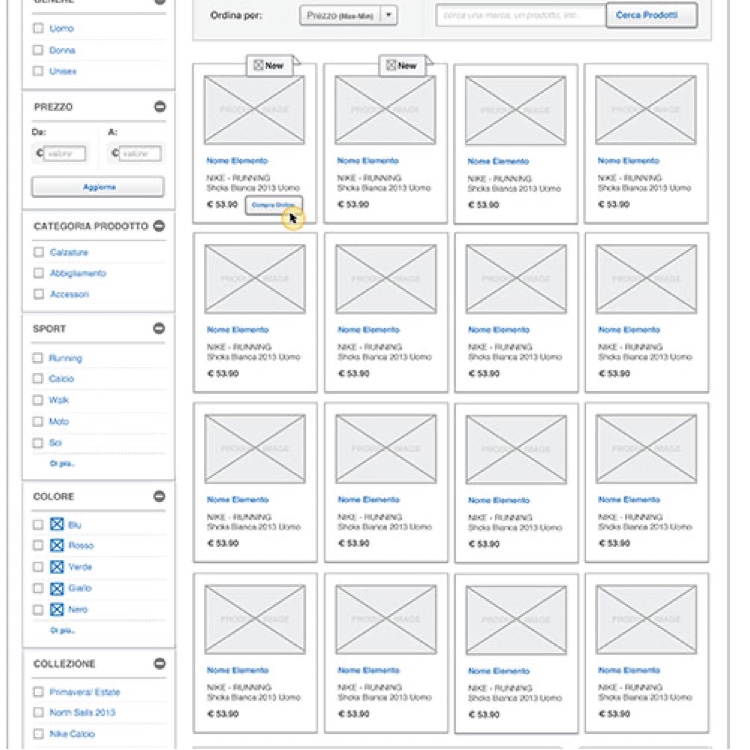
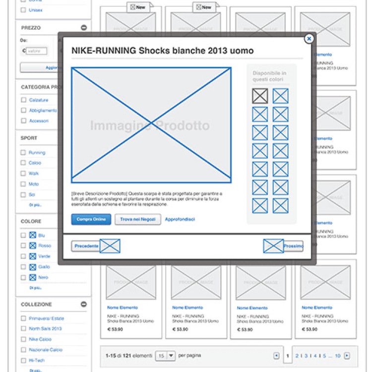
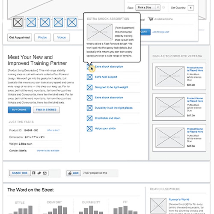
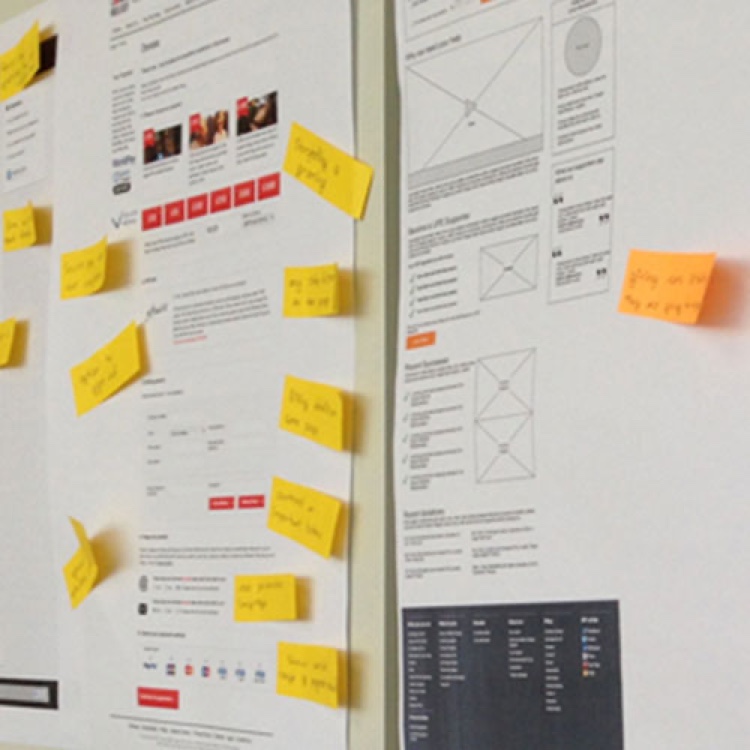
With the architecture set, I set out to design the layout and information of key pages to these flows, keeping in mind the flexibility needed for both the variety of products sold and the need of a responsive framework.
Finding products by characteristics that mattered, managing orders, and aiming at making simple interactions for the customers while mixing in the value of Maxisport promotions, offers, and voice when appropriate.
I started with the first round of wireframe that took me almost a week, and then after meetings with the client and the team, we went through 3 more interations in a time frame of 2 weeks. the constant mantra has been Iterate, Iterate and Iterate.
UI
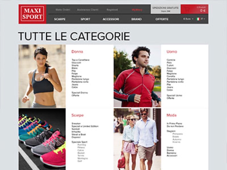
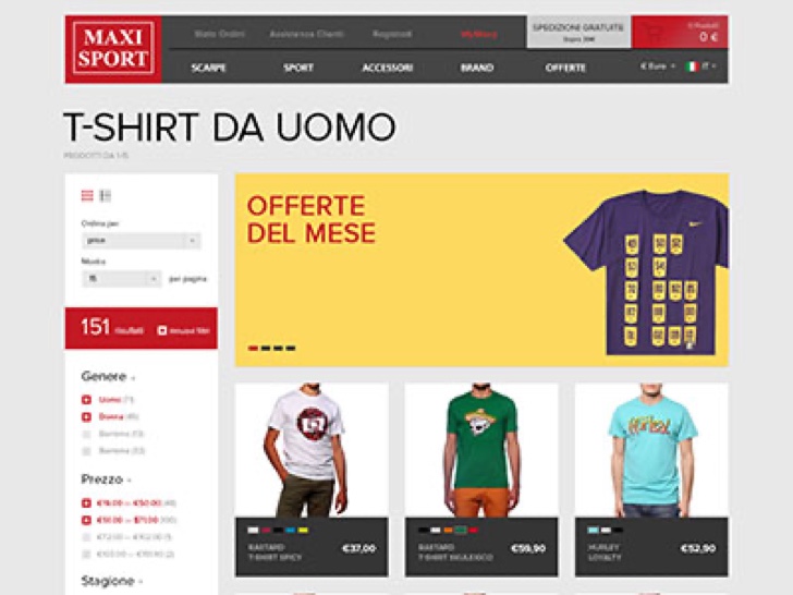
The layouts from the previous step were then treated to the overall Maxisport flagship visual brand and online styleguide (which was expanded upon as part of this project). Colors and styles were used to emphasize interaction points and to clearly comunicate information importance and hierarchy


Takeaways from the project
Research: Guerrilla test is always possible; even small sample sizes (when users are representative) are better than a higher number of “opinions”; see the user in action is valuable as gold (quality insight on real flow)
KPI: Set the KPI with client before starting generating ideas but after user research and there will be no arguing; keep the metrics simple and consistent (use the same confidence interval across the documentation); spending time to make the client understand the importance of quality data has been fundamental to the strategy of this project.
Design: Wireframe are much more likeable to get feedback from the client than paper sketch (even if it takes longer); no need for complex deliverables in Lean approach; highlight current interaction by using bright colours it's good to drive user attention on the current task.
